This page demonstrates some basic elements and typography which you will use frequently within your site. Make the text bold or make it italic. Why not bold and italic both at a time. Here is the link to Ghost website. Do you want to link a long text here how it looks in this theme.
Headings
Following is the demonstration of headings depth of h1 - h6 most of the time bloggers use heading level two to heading level four within the article.
Heading level one
Heading level two
Heading level three
Heading level four
Heading level five
Heading level six
Paragraph of dummy text
Lorem Ipsum is simply a dummy text of the printing and typesetting industry. Lorem Ipsum has been the industry's standard dummy text ever since the 1500s, when an unknown printer took a galley of type and scrambled it to make a type specimen book.
It has survived not only five centuries, but also the leap into electronic typesetting, remaining essentially unchanged. It was popularised in the 1960s with the release of Letraset sheets containing Lorem Ipsum passages, and more recently with desktop publishing software like Aldus PageMaker including versions of Lorem Ipsum.
Unordered list
- Nam purus magna.
- Fusce iaculis elit ut elit.
- Nunc a sapien urna..
- Ut mattis at purus in efficitur.
- Condimentum, elit mauris.
- Nulla odio dui, iaculis quis turpis in.
- Donec faucibus sagittis porta.
Ordered list
- Sed lorem mi.
- Praesent enim justo.
- Quisque vel justo.
- Cras nibh elit.
- Ut pulvinar ullamcorper.
- Praesent ac urna
- Ut suscipit venenatis rutrum.
Markdown example with child items
- Sed lorem mi.
- Praesent enim justo.
- Quisque vel justo.
- Cras nibh elit.
- Ut pulvinar ullamcorper.
- Praesent ac urna
- Ut suscipit venenatis rutrum.
Quote
Do you know you can type a greater than symbol and space at the beginnign of any text to make it a quote in Ghost Koenig Editor similar as markdown.
We still do not know one-thousandth of one percent of what nature has revealed to us. - Albert Einstein
Quote alternative
Ghost support 2 types of blockquotes. Here is the second one.
We still do not know one-thousandth of one percent of what nature has revealed to us. - Albert Einstein
Bookmark
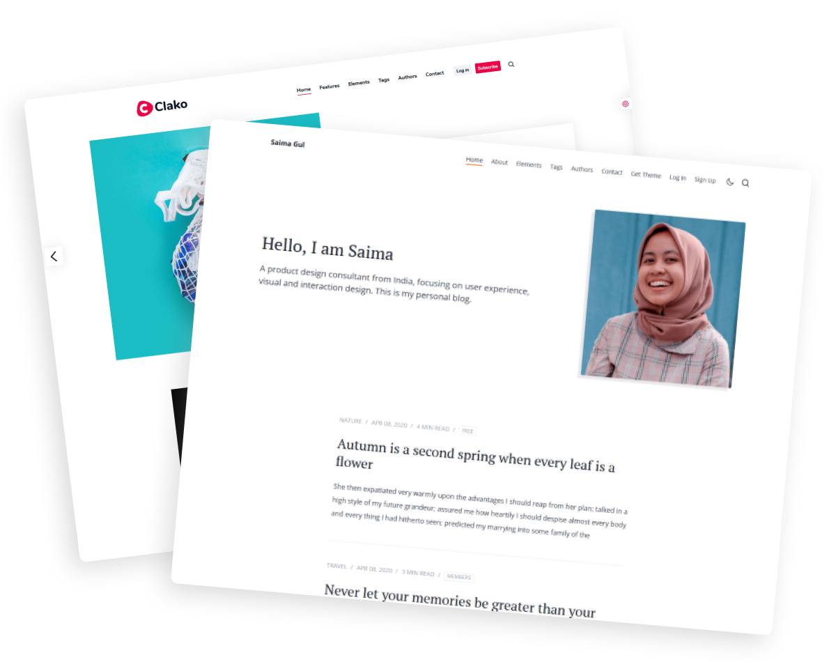
In ghost editor, just paste a link and it will automatically converted to bookmark card. It is awesome.

Optional caption
Callout
Here are some callout examples. These are useful for drawing your reader's attention.
Toggle
What is Ghost?
Ghost is an open-source publishing platform. It is a powerful app for creators and publishers to publish, share, and grow a business around their content.
Is Ghost headless?
Ghost has a very strong front-end theme system. But you can also use Ghost as a headless CMS using the power of its content API and admin API.
Product card
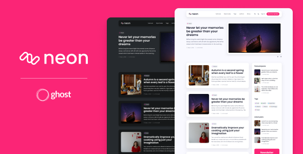
Neon - Multipurpose Ghost theme for blog and newsletter.
Neon is a multipurpose theme for the Ghost blog/publishing platform. If you are looking for a good theme for your Ghost site then "Neon" is a suitable theme for your website.
- 3 different home page layouts
- 4 different post layout
- Comments, Search, and Membership tires
Video card
This is an example of a self-hosted video. Source pixabay.com
Audio card

Image Example
In Ghost, there are three options to choose from for the size of the image. Those are normal, wide, and full. Here are the examples for all three sizes.

Do you like to add wide images in your article? You can do that in ghost and the following is an example of a such wide image.

And finally here is a full-width image. Enrich your article with supportive images. This theme handles every size gracefully

Gallery
In Ghost, you can add images in a gallery. the gallery supports up to 9 images, each row containing a maximum of 3 images. Below is an example of a gallery with 5 image





Images from Unsplash
Syntax highlighting
If you write about programming then you are covered too. Syntax highlighting feature is also implemented within this theme.
HTML
<div class="topic-card">
	<img src="" alt="" class="topic-image">
    <h2 class="h3 topic-name"><a href="">Getting Started</a></h2>
    <p class="topic-description">
    	Lorem ipsum dolor sit amet consectetur adipisicing elit.
    </p>
</div>
CSS
.comment-wrap {
    background: #fff;
	padding: 1.5em 2em;
	box-sizing: border-box;
	margin-bottom: 1.5em;
}
JavaScript
var x = 5;
var y = 2;
var z = x + y;
document.getElementById("demo").innerHTML = z;
Responsive table
You can use Html card or Markdown card in the Koenig Editor to add table in your content. This theme automatically make all table responsive.
Markdown table
As this table in the example below is not too wide, it do not needs responsive scrollbar in large screen. But In small screen a scroll bar will be visible if needed.
| First name | Lastname | Age | Lives in | Profession | Hobby |
|---|---|---|---|---|---|
| Jill | Smith | 29 | New york | Web developer | Soccer |
| Eve | Jackson | 36 | New york | Musician | Karaoke |
HTML table
Example of a wide table. The horizontal scrollbar is automatically added.
| Heading | Heading | Heading | Heading | Heading | Heading | Heading | Heading | Heading | Heading | Heading | Heading | Heading | Heading |
|---|---|---|---|---|---|---|---|---|---|---|---|---|---|
| Data | Data | Data | Data | Data | Data | Data | Data | Data | Data | Data | Data | Data | Data |
| Data | Data | Data | Data | Data | Data | Data | Data | Data | Data | Data | Data | Data | Data |
YouTube Embed
Vimeo Embed
On Monday we shipped Ghost 5.0 — our biggest release yet! Including:
— Ghost (@Ghost) May 25, 2022
📰 Support for multiple newsletters
💰 Custom tiers & offers
📊 Detailed member analytics
🖼 New themes & design settings
💡 MUCH MORE
Apparently Twitter hates links in tweets now though, so, link in bioooo 🎉 pic.twitter.com/l4txWIDapi
Twitter embed
Buttons
Ghost's editor has a button card using which you can insert buttons within your content. Followings are example of those button
You can also add different types of buttons using HTML. Following are the example of those buttons.
Standard size
Button defaultButton flat Button flat success Button flat error
Button outline Button outline succes Button outline error
<a href="#" class="btn">Button default</a>
<br>
<a href="#" class="btn btn-flat">Button flat</a>
<a href="#" class="btn btn-flat btn-success">Button flat success</a>
<a href="#" class="btn btn-flat btn-error">Button flat error</a>
<br>
<a href="#" class="btn btn-outline">Button outline</a>
<a href="#" class="btn btn-outline btn-success">Button outline succes</a>
<a href="#" class="btn btn-outline btn-error">Button outline error</a>
Large size
Button defaultButton flat Button flat success Button flat error
Button outline Button outline succes Button outline error
<a href="#" class="btn btn-lg">Button default</a>
<br>
<a href="#" class="btn btn-lg btn-flat">Button flat</a>
<a href="#" class="btn btn-lg btn-flat btn-success">Button flat success</a>
<a href="#" class="btn btn-lg btn-flat btn-error">Button flat error</a>
<br>
<a href="#" class="btn btn-lg btn-outline">Button outline</a>
<a href="#" class="btn btn-lg btn-outline btn-success">Button outline succes</a>
<a href="#" class="btn btn-lg btn-outline btn-error">Button outline error</a>
Small size
Button defaultButton flat Button flat success Button flat error
Button outline Button outline succes Button outline error
<a href="#" class="btn btn-sm">Button default</a>
<br>
<a href="#" class="btn btn-sm btn-flat">Button flat</a>
<a href="#" class="btn btn-sm btn-flat btn-success">Button flat success</a>
<a href="#" class="btn btn-sm btn-flat btn-error">Button flat error</a>
<br>
<a href="#" class="btn btn-sm btn-outline">Button outline</a>
<a href="#" class="btn btn-sm btn-outline btn-success">Button outline succes</a>
<a href="#" class="btn btn-sm btn-outline btn-error">Button outline error</a>
Thanks for reading. Have you seen what feature this theme have?

